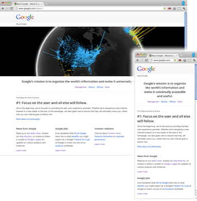
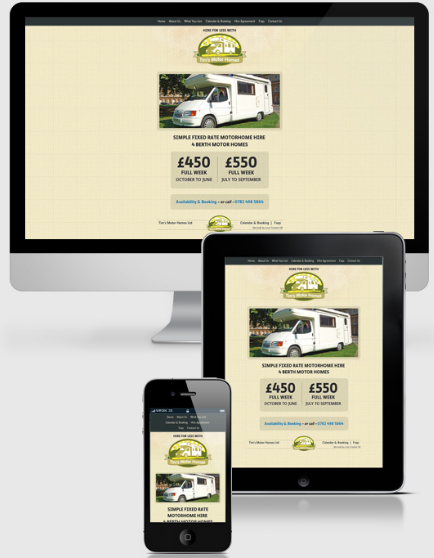
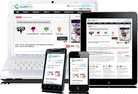
 The number of people surfing the internet from mobile devices is increasing rapidly. In fact a recent study by a market analyst firm IDC revealed that by the 2015, the number of people accessing the Internet from smartphones, tablets and other mobile devices will overtake the number computer users. Google also released a research report in January this year which showed the mobile device adoption and usage trends in five countries. As per the survey results- 69 percent of US mobile users access the internet on their phones every day. This number is even higher in Japan where 88 percent access the internet on mobile devices every day.
Developers have the challenge to make their websites easily adaptable on mobile devices. For the same, they can rely on responsive design tools like media queries to suit the requirements of a variety of screens of mobile browsers.
Benefits of Responsive Design
Responsive designs are better than specific mobile sites. The reasons are:
- No hassle of maintaining many sites. With a design that modifies itself automatically for any device saves time and also, you have the same content for all users.
- There are no canonical URL issues with a responsive design. So webmasters won’t have to be concerned about ranking issues either.
- With a responsive design, there will be no issues about redirects going wrong.
Webmasters have also noticed the steady increase in traffic from mobile devices. People using phones with HTML, CSS, and JavaScript supported browsers visit websites but the catch is the limited screen space with widths as narrow as 320 pixels. Google also addressed the issue of the choice between creating mobile friendly websites, or modifying existing sites and new ones to be displayed nicely on both computers as well as mobile phones.
As Google expresses its concern, “Creating two sites would allow us to better target specific hardware, but maintaining a single shared site preserves a canonical URL, avoiding any complicated redirects, and simplifies the sharing of web addresses. With a mind towards maintainability we leant towards using the same pages for both.”
This means that you need a responsive design for your website where:
- The pages would display properly on any screen resolution
- The content can be easily viewed on any device
- There will never be a horizontal scroll bar for mobile devices
Liquid Layout
Web masters can begin on the path to make their websites mobile friendly by making that the stylesheet enables a liquid layout. Use max width and min-height as this will not cause the larger fonts or multi-line text to break the container’s boundaries. You can also stop the fixed width images from “propping open” liquid columns by applying the following CSS rule:
img {
max-width: 100%;
}
As you know that media queries are now well-supported in modern browsers as well as a majority of mobile devices. These queries can be the distinguishing factor between sites which degrades well on a mobile browser, and the site which improves to benefit from the streamlined User Interface. An important thing to consider here is the way smartphones represent themselves to web servers.
You site has to display clearly for Android and iOS devices. You have to consider the ‘overview mode’ of view offered by these smartphones. The fact is that smartphone browsers work as high-resolution desktop browsers, display the page just as you would see it on a computer. Users then have to zoom in to see the page/read it. Your site has to adjust to the default viewport width for Android browser is 800px, and for iOS is 980px.
You have to ensure that your page is rendered on smartphones in a readable manner, not requiring the users to zoom in first. You can do this with the use of the viewport meta element:
<meta name=”viewport” content=”width=device-width, initial-scale=1″>
With this code, a 320px wide image would be sized to the full width of the screen (it will be double the number of pixels if your mobile screen is 640 physical pixels.) Most standard smartphones have a device-width in the region of 320px.
There is another benefit of setting the width to device-width in the viewport meta tag. When the user flips or changes the orientation of their smartphone or tablet it updates itself. So, you simply combining this with media queries and change your layout as the user rotates their device:
@media screen and (min-width:480px) and (max-width:800px) {
/* Target landscape smartphones, portrait tablets, narrow desktops
*/
}
@media screen and (max-width:479px) {
/* Target portrait smartphones */
}
Here is how you can use the orientation media query to aim at particular orientations without referencing pixel dimensions, where supported.
@media all and (orientation: landscape) {
/* Target device in landscape mode */
}
@media all and (orientation: portrait) {
/* Target device in portrait mode */
}
Remember that for benefitting from the power of media queries, you have to set up a liquid layout and add a few media queries to provide better user experience to mobile surfers. Opt for a broad set of breakpoints and do not target precise device resolutions. For screen resolution 800 or lower pixels, send the less important content to the bottom of the page-
@media screen and (max-width: 800px) {
/* specific CSS */
}
For smartphones:
@media screen and (max-width: 479px) {
/* specific CSS */
}
Following these steps will allow you to make the site compatible with a wide range of devices.
The Takeaway
When you work on making your site accessible on mobile devices and narrow viewports, starting with liquid layouts is the right move. However, you must be prepared to make some alterations to your design too. You can spruce up your look for many devices by adding media queries too. Keep on testing the look and functionality of your site on various mobile devices to know what all needs work. Be ready to cater to mobile traffic and see your business grow with it.


